


What do the P1 meter graphs in the app mean?
With the P1 meter you can easily monitor how and where you use energy in your home and make changes to reduce usage. Then it is of course useful to know what the graphs in the accompanying app mean.
Delivery / return delivery per day
The examples below concern a house with solar panels. The energy price for both delivery and return delivery is set at €0.25 per kWh. This can be seen at the top left of the images below. The kWh delivery for that day is indicated in purple. In green it concerns the return of solar energy to the grid. The app that accompanies the P1 meter calculates what energy costs or yields that day. This can also be seen in the top left corner of the image.
Below are four examples.
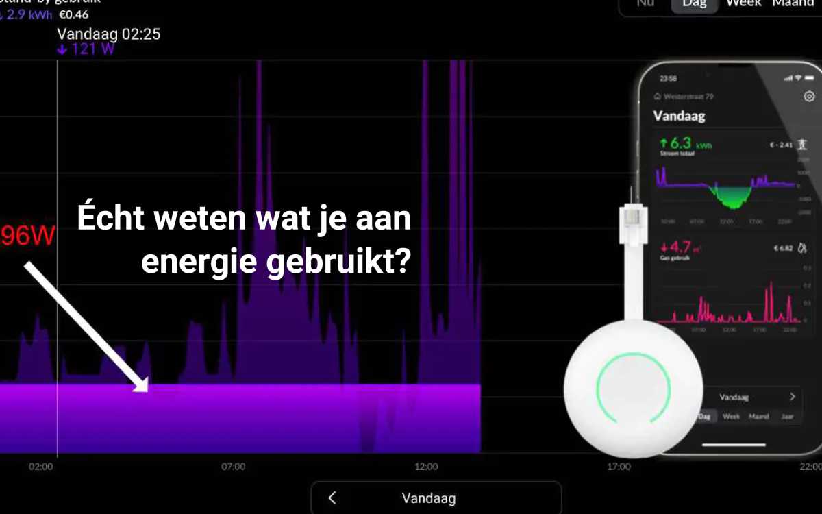
Example 1: basic consumption seen over a day*
The image above shows basic consumption between 00:00 and 07:00 and after 22:00; these are refrigerators, freezers, central heating pumps and standby consumption of, for example, a TV or device on the charger. A peak of a kettle can be seen at 7:15 am. At approximately 10:00 am the sun hits the solar panels and is fed back into the grid (the green line). At 11:00 am another device is switched on that requires more power than is supplied by the solar panels. Electric cooking takes place around 6:00 PM. Then you can see peaks of a washing machine and dryer.
Example 2: solar energy
The image below shows a beautiful sunny day. Because there are trees in front of the panels, a ‘ragged’ graph is created. Here too, a significant ‘wash peak’ is visible in the evening.
Example 3: distorted image due to scaling
The image below shows a nice example of a distorted image. The zoomed-in graph makes the electricity demand seem extremely erratic, but this is because the scale in the graph is twice as small as the previous example. In example two, +2000 is on the right, in example three, +1000 is here. The graph is therefore zoomed in more, making the differences appear larger. It is important to keep an eye on the scale; the app divides the graph itself, so one day can seem intense in terms of peaks, while little energy has been used.
Example 4: saving on energy through up-to-date insight
By choosing “Now” at the bottom of the app, a live profile will be created of consumption or generation. The base load above is about 1,200 Watts. By switching on a device, in this case a halogen lamp, we see consumption increase. After about 10 seconds the lamp is switched off again. The graph shows how much power the lamp requires; +/- 1,550 minus 1,250 = 300 Watts. On average, a lamp is on in the living room for about 1,000 hours per year. This lamp uses 300 kWh of electricity per year, which costs €75 each year. By replacing this lamp with a 20 Watt LED lamp, which produces the same amount of light, the costs go to €5.00 per year. By looking at electrical appliances in this way you can save a lot of money.